How the evolution of mobile devices impact designers.
"With the newest evolving mobile technology and related user behavior, mobile designs have also become an ever fluctuating field. Thus, in order to create an intriguing and worthy mobile presence, it is imperative to keep the latest mobile design trends in mind." (Creative Beacon, 2015)
There is a wide variety of sizes of mobile devices today, from the large screens of tablets, laptops and e-book readers to the small screens of smartphones, according to jgeorge, having the appropriate UX is important to make sure that designs respond nicely according to the screen size. An example is websites without mobile versions of them makes it hard to view. Jgeorge mentioned that to resolve this issue easily, designers have come up with two different design approaches which are Responsive Design and Adaptive Design.

Responsive Design - Websites responds to the size of the browser at any given point. Providing an optimal viewing and interaction experience such as easy reading, minimum panning and scrolling, while using it across different platforms.
Adaptive Design - "Adaptive websites adapt to the width of the browser at a specific points. In other words, the website is only concerned about the browser being a specific width, at which point it adapts the layout." (Graham, 2015)
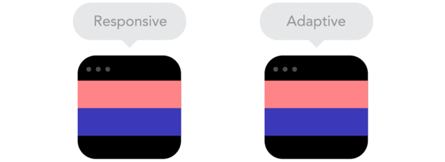
Responsive design shows how fluid it is the design changes when the size of screen changes as well whereas Adaptive is not as fluid and it takes a certain time for it to adapt to the screen size.
Responsive Design - Websites responds to the size of the browser at any given point. Providing an optimal viewing and interaction experience such as easy reading, minimum panning and scrolling, while using it across different platforms.
Adaptive Design - "Adaptive websites adapt to the width of the browser at a specific points. In other words, the website is only concerned about the browser being a specific width, at which point it adapts the layout." (Graham, 2015)
Responsive design shows how fluid it is the design changes when the size of screen changes as well whereas Adaptive is not as fluid and it takes a certain time for it to adapt to the screen size.
References
Creative Beacon. (2015). How Evolving Mobile Devices Impact Designers - Creative Beacon. [online] Available at: http://creativebeacon.com/how-evolving-mobile-devices-impact-designers/ [Accessed 16 Dec. 2016].
Editorial, S. (2011). Responsive Web Design: What It Is And How To Use It – Smashing Magazine. [online] Smashing Magazine. Available at: https://www.smashingmagazine.com/2011/01/guidelines-for-responsive-web-design/ [Accessed 16 Dec. 2016].
En.wikipedia.org. (n.d.). Responsive web design. [online] Available at: https://en.wikipedia.org/wiki/Responsive_web_design [Accessed 16 Dec. 2016].
Graham, G. (2015). The Difference Between Responsive and Adaptive Design | CSS-Tricks. [online] CSS-Tricks. Available at: https://css-tricks.com/the-difference-between-responsive-and-adaptive-design/ [Accessed 16 Dec. 2016].
Schwarz, D. (2016). What is Adaptive Design? (And is it Different from Responsive Design?. [online] SitePoint. Available at: https://www.sitepoint.com/adaptive-design-different-responsive-design/ [Accessed 16 Dec. 2016].
No comments:
Post a Comment